Tailwind CSS Starter Kit: Your Guide to Mastering Utility-First Design
Loading...
Loading...

Join JS Mastery Pro to apply what you learned today through real-world builds, weekly challenges, and a community of developers working toward the same goal.
Hey there, fellow developer! Are you tired of the never-ending cycle of tweaking and fine-tuning your ?
Do you find yourself wrestling with complex class names and struggling to maintain a consistent design across your projects?
If you agree, then you're in for a treat!
Welcome to the world of – the game-changer that's about to revolutionize the way you approach web styling. 🚀
Are you ready to bid farewell to and embrace a new era of web design simplicity?
The is your gateway to efficient styling and captivating designs.
Join us as we venture into the world of , demystifying its power and unleashing its potential.
So, whether you're sipping your morning coffee or burning the midnight oil, dive into this guide and emerge as a .
The journey starts now – let's create stunning, responsive, and impressive web designs together!
In the ever-evolving landscape of frontend technologies, one name is rising to the forefront: . This framework has become synonymous with crafting stunning web interfaces.
Whether you're working on small demo projects or enterprise-level ventures, the potency of Tailwind CSS shines through – and this cheat sheet is your compass on this exhilarating journey.
Let’s demystify the magic of . Imagine styling your web pages without having to wrangle custom CSS code. Tailwind’s secret weapon lies in its .
It empowers you to effortlessly apply styles using – the fundamental building blocks of any web element. The best part?
You don’t need to be a CSS guru. Understand the utility classes and watch your designs come to life.
Visualize a – a hallmark of web design. Traditionally, crafting it with vanilla CSS requires a handful of lines. Take a peek at the traditional approach:
.button {
  display: inline-block;
  padding: 10px 20px;
  background-color: blue;
  color: white;
  border: none;
  border-radius: 0.25rem;
  cursor: pointer;
  font-size: 16px;
}
Now, envision that button, transformed with the :
<button class="py-2 px-4 bg-blue-500 text-white rounded cursor-pointer text-lg">
  Click Me
</button>Remembering utility classes in Tailwind CSS can be made simpler by grouping them into categories and understanding the naming conventions. Here's a straightforward way to remember and organize them:
Tailwind uses a consistent naming convention for its utility classes. Understanding the abbreviations and structure can help you remember them:
Here are a few examples to illustrate this approach:
By understanding the categories, abbreviations, modifiers, and property names, you can quickly recall and apply Tailwind utility classes without needing to memorize every single class.
It's all about breaking down the naming logic and knowing where to find the classes you need for a specific styling task.
One of the easiest ways to get started with Tailwind is by using its interactive web browser mode on Tailwind Play.
This fantastic feature enables you to make updates to an existing HTML page and instantly visualize the changes. It's a perfect starting point, along with the comprehensive Tailwind documentation, to explore various features and get familiar with the Tailwind approach.
With this interactive playground, you can quickly experiment and see the power of in action!
You've Embraced Tailwind CSS – Now Embrace Its ! Tailwind CSS is your go-to toolkit for crafting stylish and responsive interfaces with ease.
But in today's world, where interactivity and adaptability reign supreme, static designs just won't cut it. Modern applications call for dynamic responses to user interactions and varying screen sizes.
Forget the headaches of traditional CSS frameworks! Tailwind CSS empowers you to effortlessly implement dynamic element states by harnessing the magic of CSS pseudo-selectors as prefixes to its intuitive classes.
Need a captivating effect? Transform an element's background on hover with a simple prefix:
<div class="bg-gray-500 hover:bg-blue-600 ...">Hover Me</div>But wait, there's more! extends its prowess beyond just "".
It embraces an array of pseudo-selectors that grant you incredible versatility. For those complex scenarios, meet the mighty "" class. It empowers you to apply styles to child elements based on the parent's state:
<div class="bg-blue-500 group ...">
    <p class="text-blue-300 group-hover:text-white"> Click for more</p>
</div>
Elevate your design game with – Where dynamic states are a breeze!
Tailwind CSS not only excels at responsive design but also seamlessly integrates dark mode styling into your web projects. With the variant, you can effortlessly adapt your website's appearance when users switch to dark mode.
Just like everything else, setting up and styling for dark and light themes is easier than before.
To use dark mode, we need to make a small change. We have to modify the configuration to include the class.
/** @type {import('tailwindcss').Config} **/

module.exports = {
  darkMode: '<HighlightGreen>class</HighlightGreen>',
  theme: {
    extend: {
      // ...
    },
  },
  plugins: [],
}
If we don't specify it, the theme styles will automatically adapt based on the user's Operating System preference – quite interesting!
We only need to mention this field if we want to offer a theme toggle on the website. It's a choice we make!
<div class="mx-auto max-w-md overflow-hidden rounded-xl bg-gray-50 shadow-lg dark:bg-slate-800 md:max-w-2xl">
    <div class="md:flex">
      <div class="md:shrink-0">
        <img class="h-52 w-full object-cover md:h-full md:w-48" src="/img.jpg" alt="My image alt description" />
      </div>
      <div class="p-8">
        <a href="#" class="mt-1 block text-lg font-bold leading-tight text-gray-800 dark:text-white">My awesome card</a>
        <p class="mt-2 text-gray-500 dark:text-gray-300">Lorem ipsum dolor sit amet, consectetur adipiscing elit. Donec accumsan eros elementum massa dignissim.</p>
      </div>
    </div>
</div>
In this updated example, the dark mode variant comes into play. Let's break it down:
Tailwind makes dark mode implementation hassle-free by automatically detecting the user's preferred color scheme through the prefers-color-scheme CSS media feature.
By incorporating these dark mode utilities, you enhance the UX and demonstrate your attention to detail by providing a design that adapts to different viewing preferences.
Alright, gather 'round as we dive into the mesmerizing world of Tailwind CSS – where functions and directives work their enchantment on your styles.
Get ready for some behind-the-scenes wizardry that’ll have your CSS dancing to your tune!
Alright, gather 'round as we dive into the mesmerizing world of Tailwind CSS – where functions and directives work their enchantment on your styles.
Get ready for some behind-the-scenes wizardry that’ll have your CSS dancing to your tune!
Let's talk directives – these are Tailwind's special commands that make your CSS do a little jig.
This big boss directs the orchestra. It brings in Tailwind's base, components, utilities, and variants styles into your CSS. It's like your backstage pass to the styling show.
Meet the director of categories – base, components, and utilities. You get to tell your styles which bucket to hop into.
This one’s a ninja. It lets you sneak in existing utility classes into your custom CSS. Think of it like mixing and matching style ingredients.
Example:
.custom-button {
  @apply bg-blue-500 text-white font-bold py-2 px-4 rounded;
}Need a CSS file to follow different rules? Wave the @config wand and let Tailwind know which config file to dance with.
@config "./tailwind.admin.config.js";

@tailwind base;
@tailwind components;
@tailwind utilities;Now, let’s talk functions. These are like spells that give you dynamic powers over your styles.
This wizard lets you access Tailwind config values using dot notation. It’s like whispering secrets to your styles.
.content-area {
  height: calc(100vh - theme(spacing.12));
}
Got a value with a dot? No problem – use square brackets.
.content-area {
  height: calc(100vh - theme(spacing[2.5]));
}Now, meet the maestro of media queries. It crafts these responsive symphonies that perfectly match your breakpoints.
@media screen(sm) {
  /* Media query for the 'sm' breakpoint */
}
With , you compose media queries that rock to the rhythm of your breakpoints.
So, there you have it – functions and directives, the secret ingredients that make Tailwind CSS so much more than just styling.
In the file, you'll discover the cool theme and plugin fields. These are your tickets to unlocking Tailwind CSS's awesomeness, letting you tweak it just the way you want.
The theme part lets you supercharge Tailwind CSS by adding your own stuff, like new colors or spacing. When you do this, Tailwind CSS automatically creates classes that work seamlessly with the ones it already has.
You can even change the values it comes with to make Tailwind totally your own.
Want a taste of how this works? Check out this snippet from your file. Here, we're switching up the default sans fontFamily and throwing in a new color we're calling .
module.exports = {
  theme: {
    fontFamily: {
      sans: ['YourCustomFont', 'system-ui', 'sans-serif'],
    },
    extend: {
      colors: {
        nightown: '#123456',
      },
    },
  },
};Plugins are like the cherry on top that makes Tailwind even more awesome. Let's highlight two standout plugins: and .
gives you classes to make your content look all fancy with Markdown text—super useful when you're working with HTML generated by CMS.
are where it's at for styling your form elements like input, textarea, and select. They come pre-styled so your forms look slick right out of the box.
If you want to take control, you can slap on the classes to choose where these styles do their thing.
With Tailwind CSS, you're in for a ride of endless customization and style expansion. It's all about making your styles your own, and Tailwind's got your back.
Tailwind has your back when it comes to accessibility, especially for screen readers. It provides nifty utilities like and classes to ensure a seamless experience for all users.
Imagine an <a> tag with an SVG icon and a hidden text for screen readers.
<a href="#">
  <svg><!-- ... --></svg>
  <span class="sr-only">User Profile</span>
</a>
The class does the magic – it makes the "User Profile" text invisible to the naked eye but still there for those who rely on screen readers.
Now, let’s say you want to show the text for larger screens but keep it hidden for smaller ones. The class combo is your ticket to this flex.
<a href="#">
  <svg><!-- ... --></svg>
  <span class="sr-only sm:not-sr-only">User Profile</span>
</a>
With this, the text remains hidden for small screens, but magically appears on larger ones.
Tailwind’s accessibility utilities are like bridges that connect all users to your content.
With and , you’re weaving a tapestry of inclusivity where everyone gets a front-row seat, no matter how they experience your site.
Let's venture into the world of animations and interactivity, where Tailwind CSS truly shines. Get ready to add dynamic flair to your designs!
Start with smooth transitions using the transition-{properties} utilities. These help you specify which properties should transition when they change. For example:
<button class="transition ease-in-out delay-150 bg-blue-500 hover:-translate-y-1 hover:scale-110 hover:bg-indigo-500 duration-300 ...">
  Download
</button>Tailwind offers four standard animations to give life to your elements:
Create a spinning animation, like a loading indicator, with the utility.
Example:
<div class="animate-spin h-6 w-6 ..."></div>Make an element scale and fade like a radar ping animation using .
Example:
<div class="animate-ping h-6 w-6 ..."></div>Add a gentle fade-in and fade-out animation to an element with .
Example:
<div class="animate-pulse h-8 w-8 rounded-full ..."></div>Use to make an element bounce up and down.
Example:
<div class="animate-bounce h-10 w-10 rounded ..."></div>Tailwind makes your elements interactive and engaging:
Control cursor appearance on hover:
<button class="cursor-pointer ...">Click me</button>
<button class="cursor-wait ...">Please wait</button>
<button class="cursor-not-allowed ...">No access</button>Enable or disable pointer interactions:
<div class="pointer-events-auto ...">Clickable</div>
<div class="pointer-events-none ...">Not clickable</div>
With these animations and interactive elements, lets you create engaging and user-friendly designs effortlessly. It's all about adding that extra layer of magic to your web projects!
Now that you have understood what is and how it works, let’s explore a few tips & tricks.
We’ll first explore the tricks or special utilities we can use to make our development more efficient:
Changes the default browser color for elements like checkboxes and radio groups
<div class="my-4 flex flex-col">
  <label> <input type="checkbox" checked /> Browser default </label>
  <label> <input type="checkbox" class="accent-pink-500" checked /> Customized </label>
</div>Usually, when building a responsive website, we have to take care of the text size on different devices. Something like this:
<p class="sm:text-7xl text-5xl">Something Nice</p>Using the custom style approach we discussed and the min , we can do something like this:
<p class="text-[min(10vw,70px)]">Something Fluid</p>The result, the second approach is much better and more responsive than the other. Instead of relying on the media screen, we kind of calculate the value depending on the screen size automatically.
Well, yeah. If you take the time to learn it well, you can perform certain tasks that are typically done using JavaScript with alone, without requiring JavaScript. It might sound incredible, right?
Think about how often we've made an accordion or relied on libraries or states to manage it.
Let me demonstrate an example of how we can achieve this without using JavaScript, just with pure .
<div class="max-w-lg mx-auto p-8">
  <details class="open:bg-white dark:open:bg-slate-900 open:ring-1 open:ring-black/5 dark:open:ring-white/10 open:shadow-lg p-6 rounded-lg" open>
    <summary class="text-sm leading-6 text-slate-900 dark:text-white font-semibold select-none">
      Why do they call it Ovaltine?
    </summary>
    <div class="mt-3 text-sm leading-6 text-slate-600 dark:text-slate-400">
      <p>The mug is round. The jar is round. They should call it Roundtine.</p>
    </div>
  </details>
</div>
Isn't that crazy???
We used the open: selector along with proper HTML tags, i.e., details (without which we won’t get that toggle).
If you worked with file inputs, you know the pain of styling the default layout. Thankfully, provides a better solution.
Use the prefix and use any utility to customize the input however you want.
<label class="my-4 block">
  <input type="file" class="block w-full text-sm text-slate-500 file:mr-4 file:rounded-full file:border-0 file:bg-violet-50 file:px-4 file:py-2 file:text-sm file:font-semibold file:text-violet-700 hover:file:bg-violet-100" />
</label>Do you want to override the default blue or other highlight that appears when a user selects a text on your website? selection is a way to go.
<div class="selection:bg-green-400 selection:text-white">
   <p>Subscribe to JavaScript Mastery YT channel</p>
</div>
Be creative, do whatever you want. You have to complete control by using just a few lines of code.
Not a fan of white or black caret? Use then.
<textarea class="w-full border border-zinc-200 caret-pink-500 p-2" placeholder="type something.."></textarea>Try typing it into the textarea, and you’ll notice the caret color to be pink 😃
These are just a handful of examples. Tailwindcss offers many unique tools such as those for different states like before & active, styles that work only on certain screen sizes like landscape or portrait, styles for ARIA and , gradients animations, and it even lets you apply distinct styles when .
The and pseudo-selectors in CSS are used to add content before or after an element without changing the actual HTML structure.
They're great for inserting things like , , or even .
These pseudo-elements are like invisible children of the selected element—they only exist in CSS.
Both and need the property to work.
Even if you just want to insert an empty block or shape, you still need to define , even if it’s just an empty string ().
Here’s how they behave:
:
Creates content that shows before the main content of an element.
:
Creates content that shows after the main content of an element.
Let’s break it down with a more detailed example.
Imagine you have a <button> that you want to style by adding a decorative arrow before the text:
<button>Click Me</button>Using , you can insert an arrow before the "Click Me" text like this:
button::before {
  content: "← "; /* Adds an arrow before the button text */
  color: blue; /* Colors the arrow blue */
  font-size: 25px; /* Makes the arrow bigger */
  margin-right: 8px; /* Adds some space between the arrow and the text */
}Let’s say you want to add an icon after every link to make it clear that it leads to an external site:
Imagine you have a <a> tag that you want to style by adding a decorative arrow after the text:
<a href="https://example.com">Visit Example</a>With , you can add a small icon after the link:
a::after {
  content: "🔗"; /* Adds a link icon after the text */
  margin-right: 5px; /* Adds a little space between the text and icon */
}
Now, the link would look like this: "Visit Example 🔗".
By default, the and pseudo-elements are inline. That means they behave like text—sitting on the same line as the content.
But you can change this using .
Block Elements : If you want these pseudo-elements to act like block elements (taking up the full width), you can use .
div::after {
  content: "Before the content";
  display: block;
  font-weight: bold;
}
This adds the text "Before the content" as a bold, block-level element before a <div> content.
and aren't just for adding text. You can style them just like any other element. For example, you can give them:
But you can change this using .
Suppose you want to add a decorative circle before a heading. Here's how you could do it:
<h2>My Awesome Heading</h2>And the CSS:
h2::before {
  content: ""; /* Empty content, we’re just adding a shape */
  display: inline-block; /* So it sits inline with the text */
  width: 10px;
  height: 10px;
  background-color: red; /* Makes the circle red */
  border-radius: 50%; /* Turns it into a circle */
  margin-right: 10px; /* Adds space between the circle and the text */
}
This will create a small red circle that appears before the heading text, without touching the HTML.
Here are some real-world uses for and :
Here are some real-world uses for and :
I hope this gives you a solid understanding of how and work!
You can style the and pseudo-elements using the before and after modifiers in Tailwind. Here's an example:
<span class="after:content-['*'] after:ml-0.5 after:text-red-500 block...">Email</div>When using these modifiers, Tailwind will automatically add by default, so you don’t have to specify it unless you want a different value.
Responsive design is a crucial aspect of modern web development that ensures your website looks and functions seamlessly across a variety of screen sizes and devices. With , achieving responsive design is made incredibly easy.
Tailwind CSS provides a range of utility classes that can be applied conditionally based on different screen breakpoints. These breakpoints are essentially specific minimum widths that correspond to different device sizes.
Here are the default breakpoints along with their associated prefix and CSS media query:
To create responsive elements using Tailwind, you simply prefix the utility class with the breakpoint name followed by a colon. This ensures the utility class applies only at or above that specific breakpoint.
Tailwind follows a mobile-first approach, meaning:
Let’s create a responsive card using Tailwind:

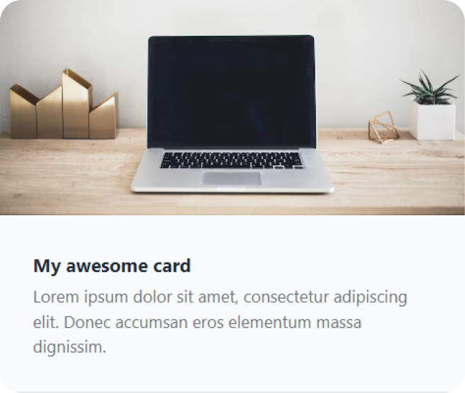
<div class="mx-auto max-w-md overflow-hidden rounded-xl bg-gray-50 shadow-lg md:max-w-2xl">
    <div class="md:flex">
      <div class="md:shrink-0">
        <img class="h-52 w-full object-cover md:h-full md:w-48" src="/img.jpg" alt="My image alt description" />
      </div>
      <div class="p-8">
        <a href="#" class="mt-1 block text-lg font-bold leading-tight text-gray-800">My awesome card</a>
        <p class="mt-2 text-gray-500">Lorem ipsum dolor sit amet, consectetur adipiscing elit. Donec accumsan eros elementum massa dignissim.</p>
      </div>
    </div>
  </div>
In this example:
Tailwind CSS simplifies responsive design , allowing you to easily manage styles across different breakpoints. Your website remains visually appealing and user-friendly across various devices and screen sizes.
A premium collection of meticulously crafted user interface components and templates built using the Tailwind CSS framework.
A set of unstyled, fully accessible UI components that can be used as a foundation for creating custom designs. Built by the creators of Tailwind CSS.
Shadcn combines the power of Tailwind with artistic designs. Beautifully designed components built with Radix UI and Tailwind CSS.
Tail-kit provides a comprehensive set of carefully crafted, easy to customize, fully responsive UI components, Templates & Tools for your Tailwind CSS.
Radix UI is a cutting-edge toolkit designed to create advanced UI components with an emphasis on accessibility and user experience.
Preline UI is an open-source set of prebuilt UI components based on the utility-first Tailwind CSS framework. With a focus on high-quality design.
The most popular component library for Tailwind CSS. DaisyUI adds component class names to Tailwind CSS so you can make beautiful websites faster than ever.
Explore an extensive array of ready-to-use components, organized into three distinct categories: marketing, e-commerce, and applications.
Contemporary Tailwind CSS component library with 150+ rich components for app & product development. Each offers multiple variations to suit your requirement.
With more than 500 Tailwind components. These components are based on the Bootstrap framework, but they have a better design & a lot more functional.
This is a library that contains a wide variety of free and paid templates. They have a collection of around 25 templates, mostly geared toward startups & SaaS.
A collection of predefined Tailwind CSS components designed to facilitate rapid website prototyping and development.
It offers a wide selection of 150+ Tailwind components and templates with versatile styles. It's adaptable for various frameworks like Angular, Vue, React, Svelte, etc.
Sira is a design system with reusable components. Compatible with Vue, React, and more. Offers themes, dark mode, & predefined Tailwind styles.
Containing over 500 complimentary and premium components, blocks, sections, and templates, this kit offers an extensive selection.
You've taken your first steps toward mastering one of the most efficient and flexible CSS frameworks available. With Tailwind, you now have the power to rapidly design and style your applications using utility-first classes.
But don’t stop here—practice is key! Experiment with customizing your Tailwind config, explore plugins, and build increasingly complex UI components. The more you use Tailwind, the faster and more intuitive it will become.
Check out our Tailwind CSS Full Course video, where we create a responsive, production-ready design step by step. It's the perfect way to level up your skills:
Happy coding! 🚀
| Utility classes for managing spacing between elements using margin and padding. |
| After the abbreviation and modifier, the property name is added. For example, for margin-2, for padding-y-4, for center-aligned text, etc. |
| Background color of a shade of blue. |
| Apply Flexbox layout with column direction. |
| Gray border with a default width. |

| 1280px (min-width: 1280px) |
| 1536px (min-width: 1536px) |


